
Client: Target.com & Disney Corporation
Role: Designer / Animator
Disney Studios partnered with Target to create a clothing line for teenage girls based on the television series "Sonny with a Chance". We were tasked to come up with a fun and innovative site that not only appealed to kids, but also appealed to the parents. Live video integration as well as an interactive style mix-n-match guide allowed the consumer to interact with each model, see what they were wearing and see product description, price and most importantly purchase directly within the experience. Besides the single garment purchase, consumers were also given the option to "buy this look" where the entire outfit was placed in their cart. Other things to note are the collections may change out up to five times a year. Therefore the site design and build must be flexible. Each collection is here for a limited time only.
The screens shown are as follows:
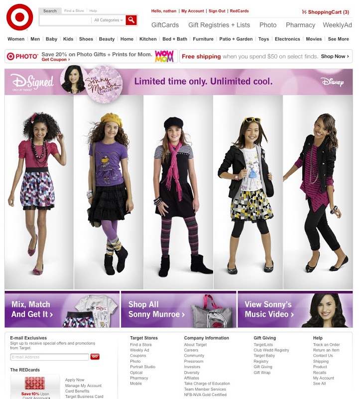
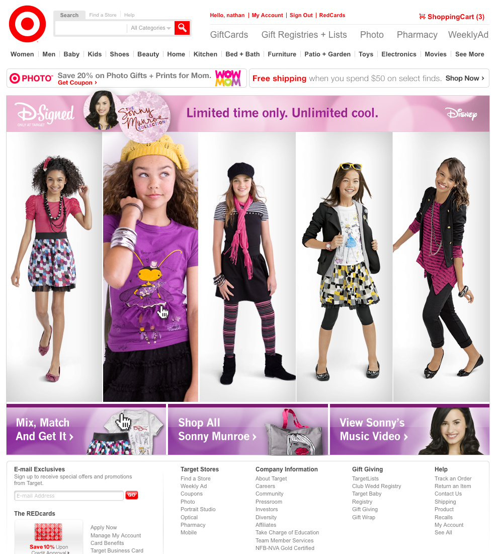
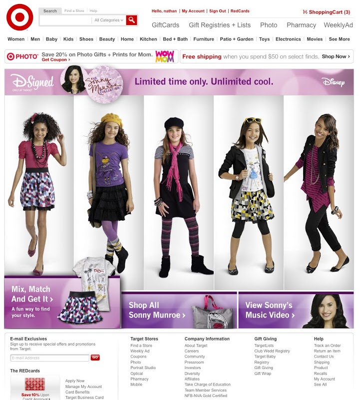
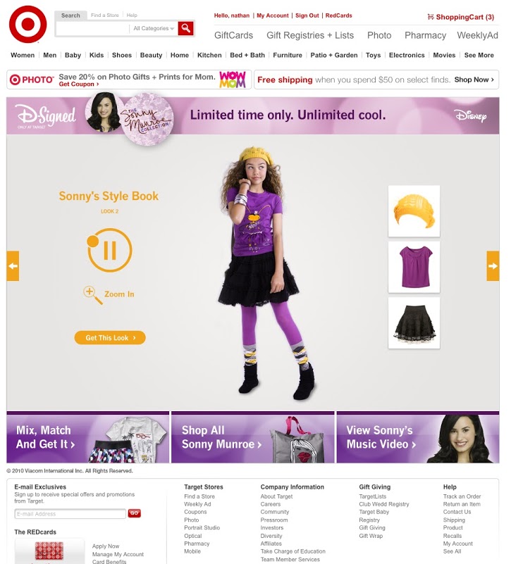
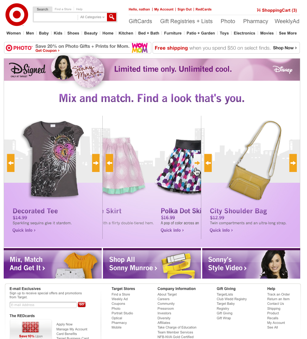
D-SIGNED HOME PAGE
Key Features: Live video integration / Energetic color scheme / Appeals to both teens and parents
Main screen / Model rollover / Sub-content rollover
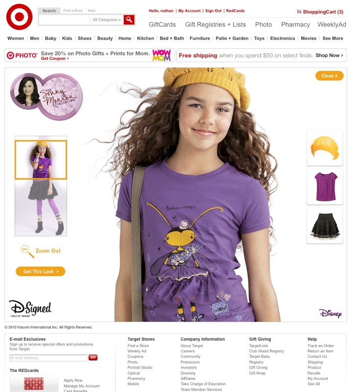
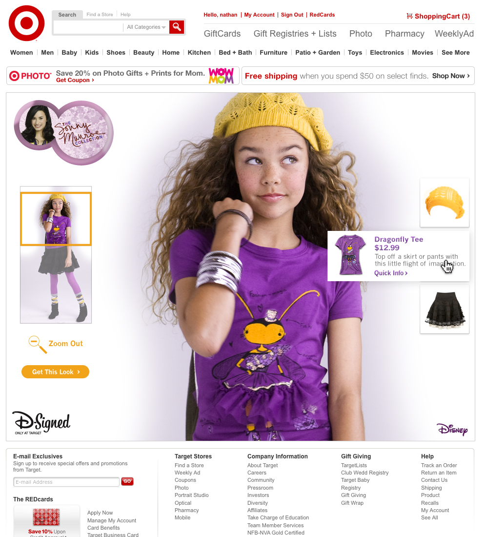
D-SIGNED MODEL DETAIL PAGE
Main screen / Model detailed zoom / Product rollover
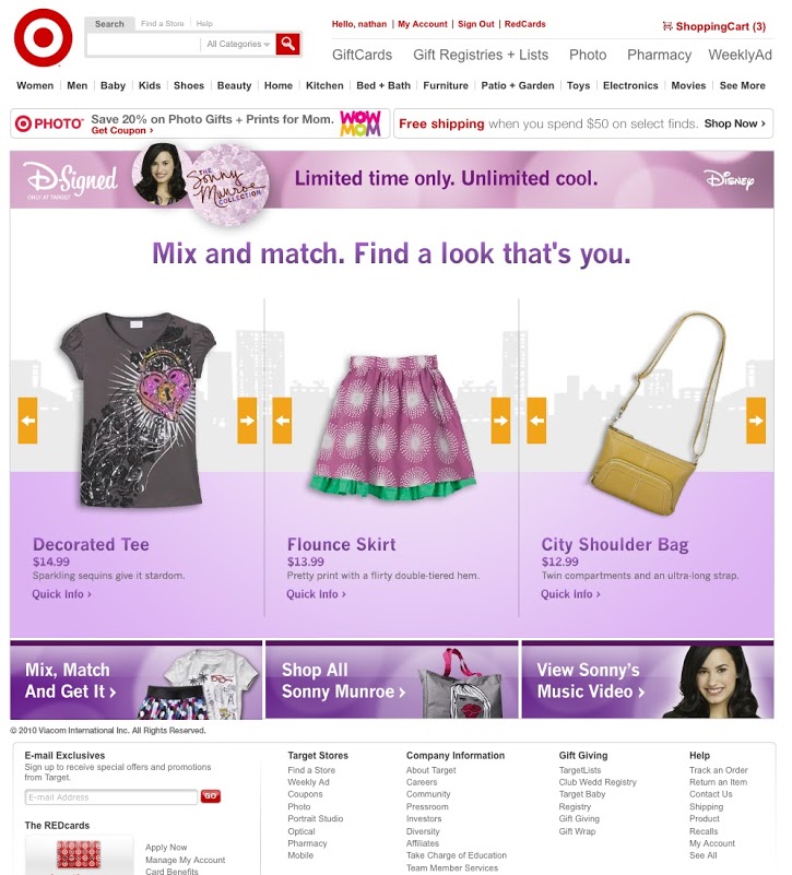
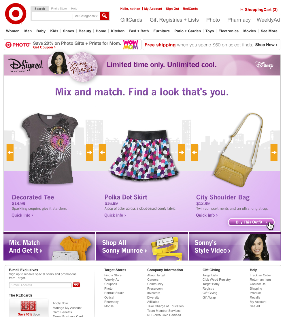
D-SIGNED MIX AND MATCH PAGE
Main screen / Outfit configuration / Outfit Configuration complete-purchase option
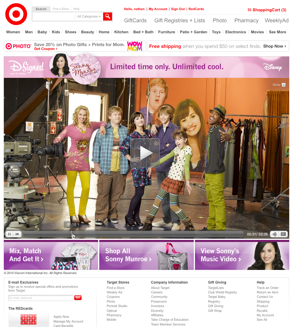
D-SIGNED SONNY MUSIC VIDEO
Main screen
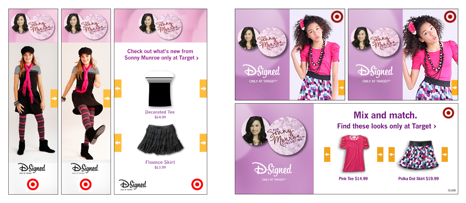
D-SIGNED EXTERNAL EXPANDABLE SHOP-ENABLED VIDEO ADS
160x600 Video banner / Expanded shop-enabled / 300x250 Video banner / Expanded shop-enabled
Client: Target.com
Role: Art Director / Designer
Concept design for a new Target sub-site to sell well-known brands and products at a lower cost for a very limited time. The idea would be to entice non-customers into purchasing a very recognizable brand for less than they can purchase it anywhere else. Ideally, it would draw new customers in and keep them coming back after they realize the depth and breadth of the areas they were interested in.
The site would be tablet and mobile optimized to create a singular user experience from one device to another. Easy to use while offering a very streamlined shopping cart to get them out the virtual door with products they want and love.


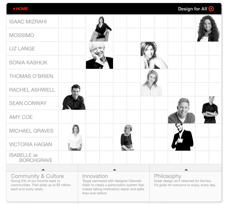
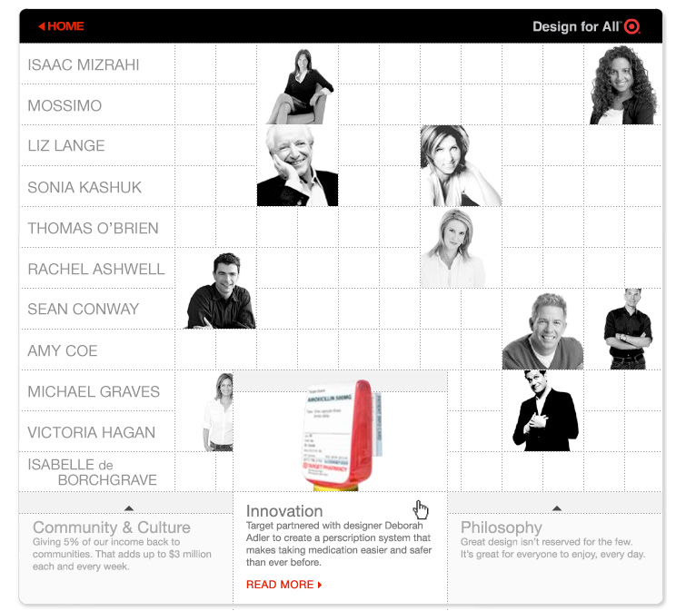
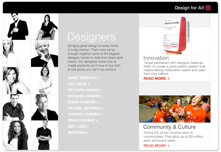
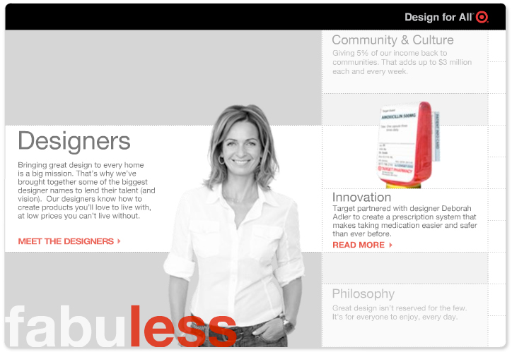
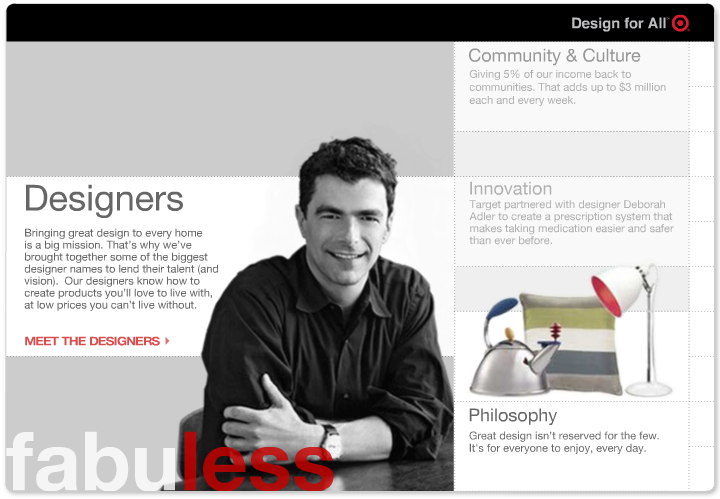
Client: Target
Role: Principal Visual Designer: Concept / Motion / Prototype
Project: Design For All-Target partners up with world renowned designers in a variety of fields to offer up amazing designed home goods, clothing, furniture and more.
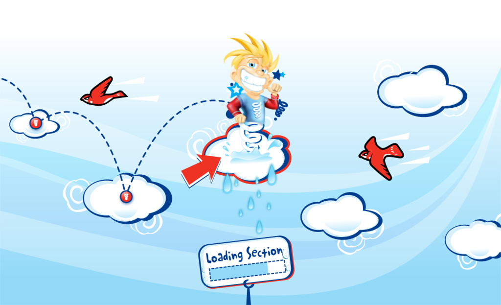
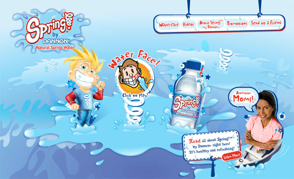
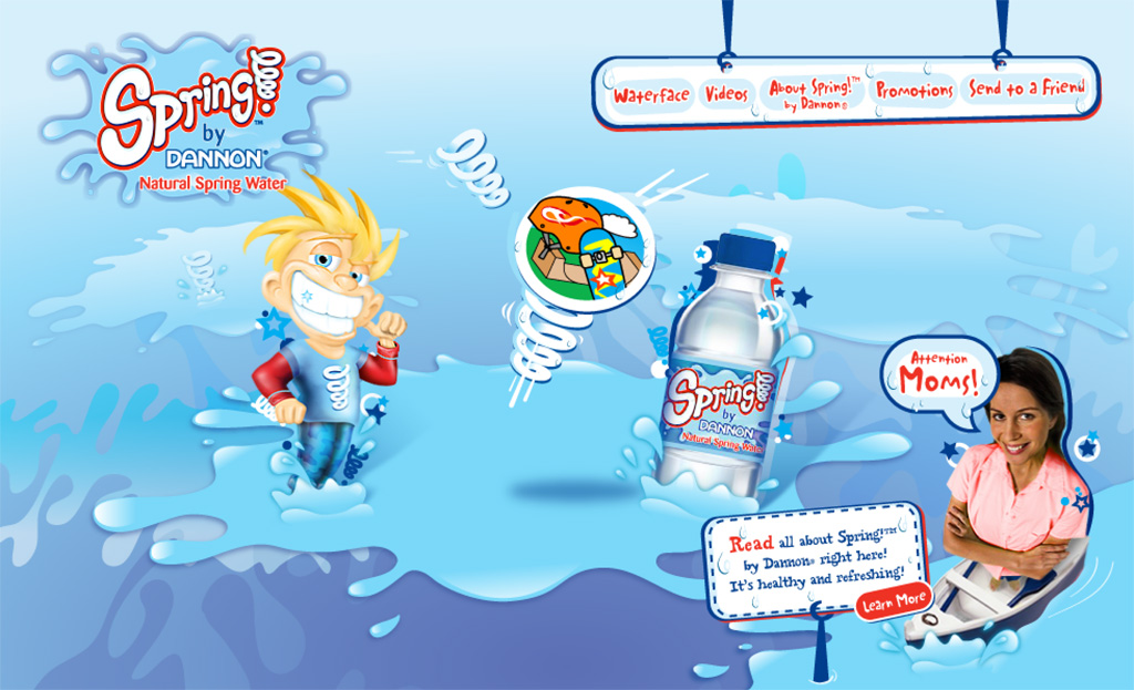
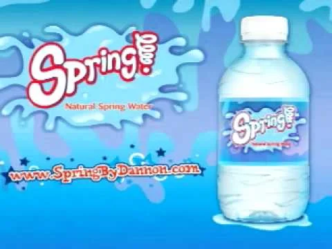
Client: Coca-Cola
Role: Designer/Animator
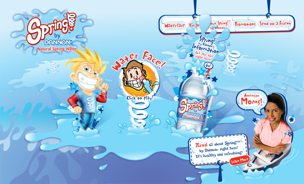
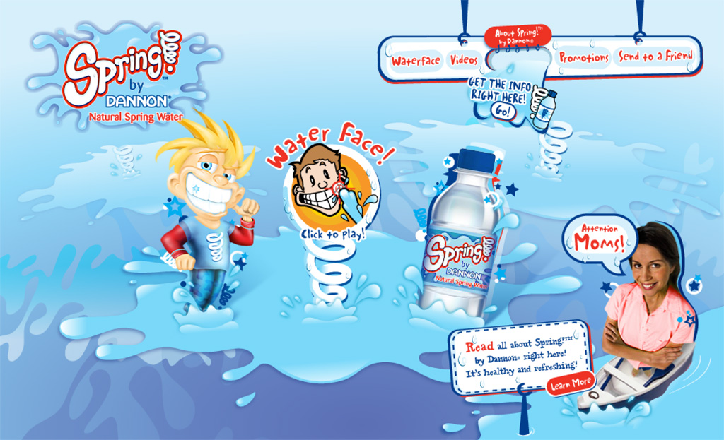
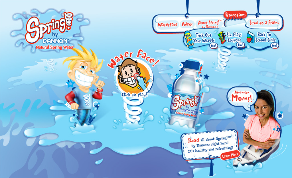
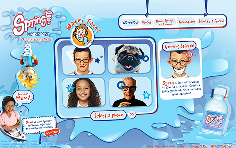
Coca-Cola decided to enter the world of water. With the amount of heat the soda industry was taking, Coca-Cola stepped up to create a very parent focused and kid-friendly site that pushed the idea of drinking water rather than other sugary beverages.
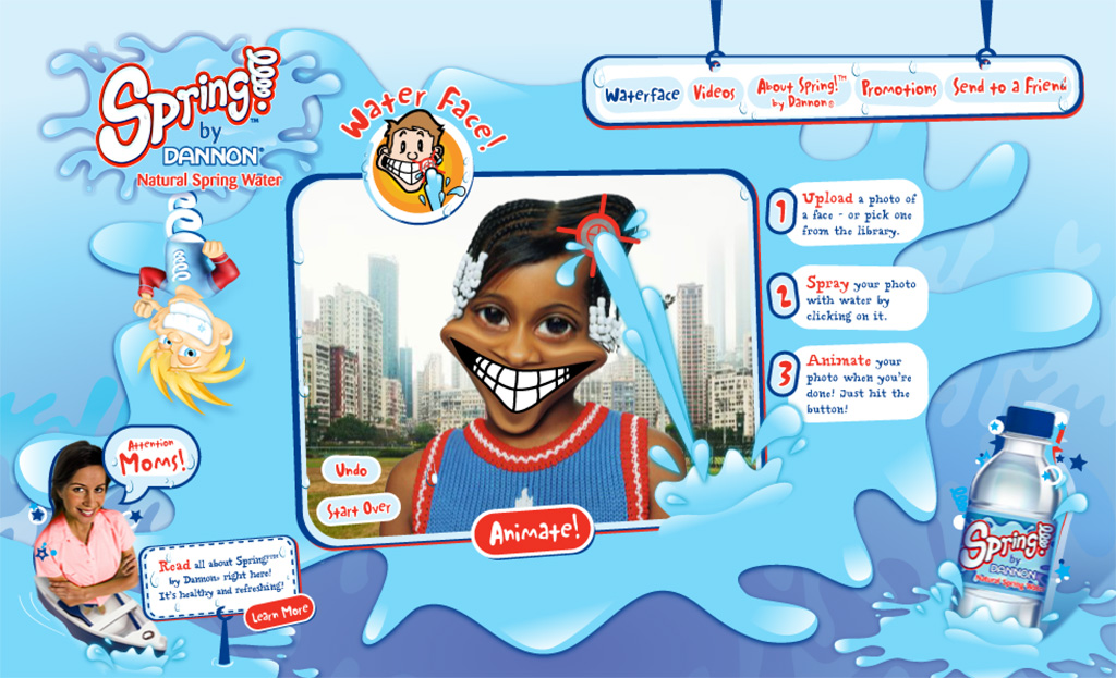
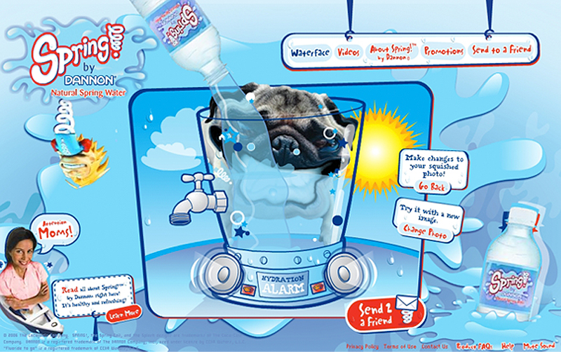
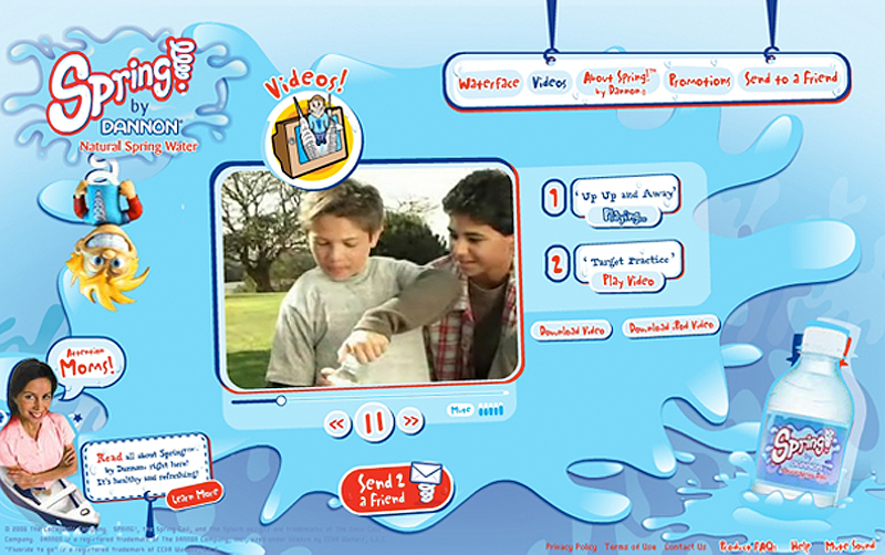
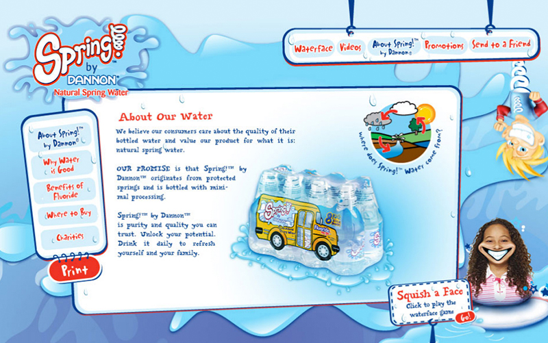
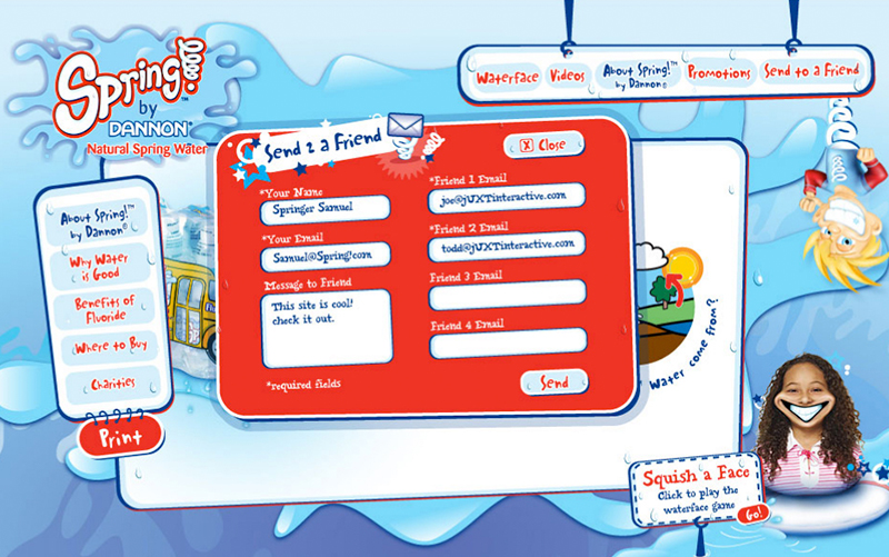
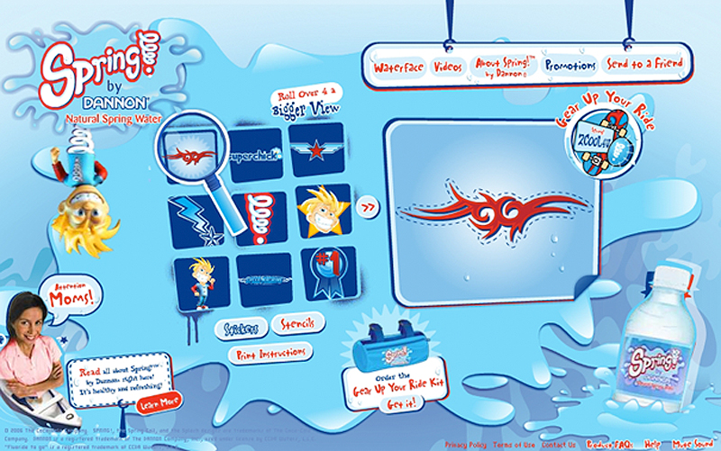
The site offered interactive games, printable stencils and stickers as well as an interactive water distortion tool with a library of images (animals, humans, aliens and cute cartoons) to distort and morph into funny stretched portraits that they could save and send to their friends. Aside from all the games and interactive elements, it also offered an array of valuable information to the parents about the importance of getting kids to drink water and to stay active.
The screens shown are as follows:
CURRENT DESIGN
Key Features: Cartoon based frame-by-frame animations / Live 3-D animation integration / Vibrant color palette / Playful typography / Appeals to both kids and parents / Smooth animation transitions
Loading game screen / Landing screen content / Landing screen spring interaction / Landing about section sub-navigation / Landing promotion section sub-navigation / Water face image library screen / Water face morph interaction / Water face finalize morph-send to a friend / Video screen / About screen / About send to a friend screen / Promotions sticker library screen / Commercial animation
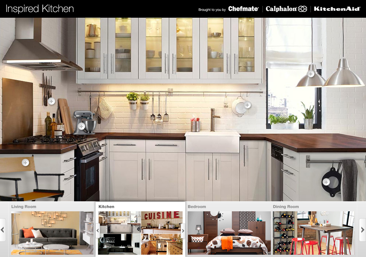
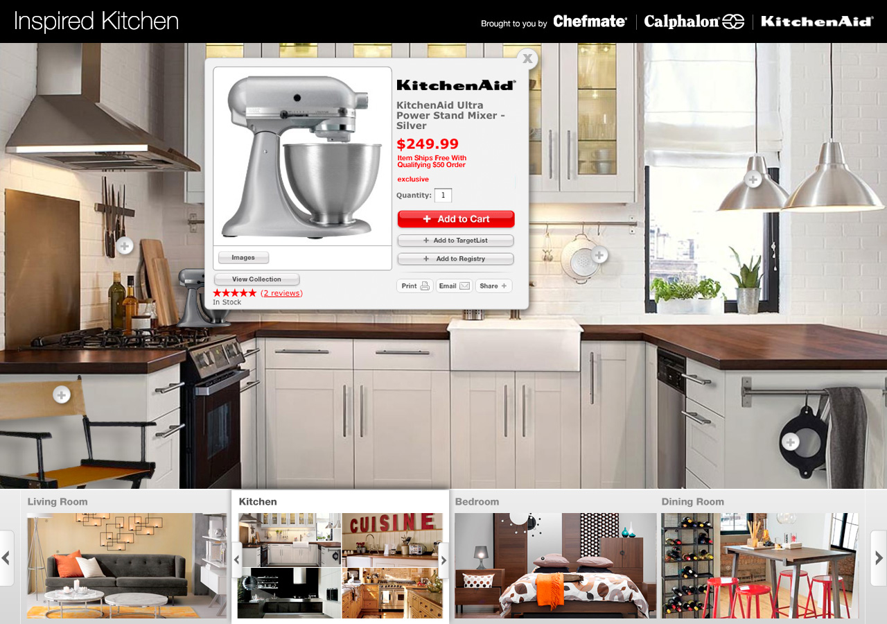
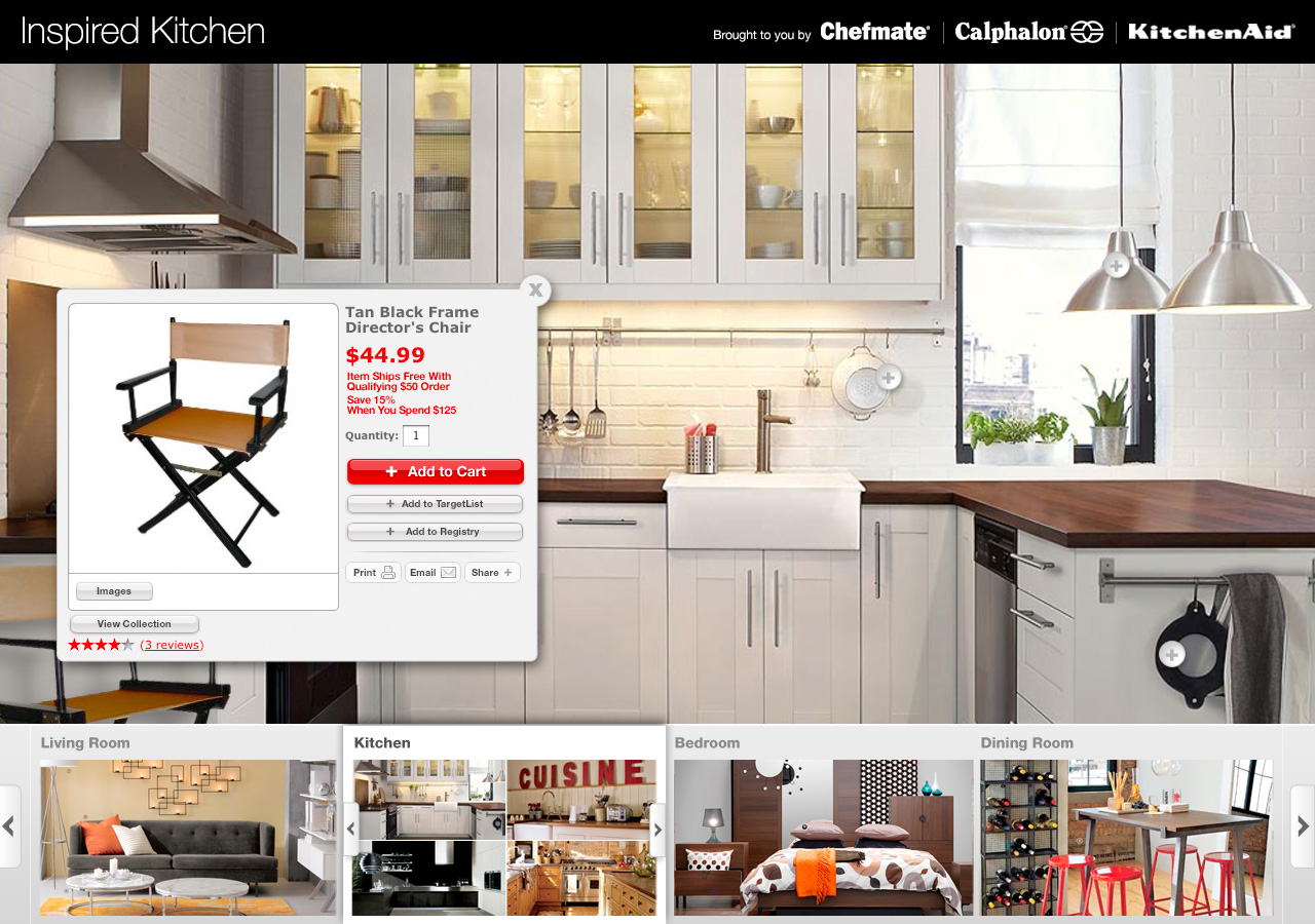
Client: Target
Role: Principal Visual Designer: Concept / Motion / Prototype
Project: Inspired Home: Through video allow the customer to explore inspiring houses filled with shopable rooms.
client: personal project
Role: Principal Visual Designer: Concept / Motion / Prototype
Project: A personal photo gallery that combines the sites and sounds of landscapes, people and places across the globe.


client: personal project
Role: UX/UI Designer, Visual Designer: Concept / Prototype / Hi Fidelity Renders
The brief for this project was as follows:
#1 Apply a visual design to multiple surfaces
Demonstrate how you can apply a common visual language for a NASA time travel app, which consists of a UI that identifies where in time you are, where in time you want to go, and an actionable affordance to initiate time travel (don’t worry about flows). Provide a screen for both an iOS phone and an Android tablet that are on brand, while also being considerate of native platform design guidelines.
Research & Exploration
Phase 1: Brainstorming main features/user interface
Questions I initially considered dealt with whether the application should be date and time specific; whether the travel should be based on historical/future real world events or a custom search (image or text), or perhaps linked to a user’s photo gallery to allow travel back to uniquely significant times and places. I also explored the idea of allowing social connection with other users through shared photo libraries. Or maybe a broader search was more user-friendly, one which allowed travel by year, decade, century or era.
In the end, I chose a simple and more elegant approach, focusing solely on the date and time of travel rather than overcomplicating the choices. After all, time travel should open up the user to a limitless range of possibilities.
Phase 2: Branding
From NASA branding guidelines I pulled key colors and fonts that I later altered slightly to give the application an updated look and feel that remained on-brand. I also explored several NASA applications on a variety of devices and searched the NASA image database for assets to incorporate in my final comps. These images provided some textural elements and possible backdrops for the application.
Sketching & Wireframing
The first step was to design how the user would toggle between travel times and confirmation. I considered dials, scrolling widgets, imagery related to the time selected, as well as other more obscure methods that might not have been as logical to first-time users.
Some of these initial layouts also supported a sub-navigation system that included past trips, favorite trips, snap a photo of your current time/location, share your trips with friends and see where they have been recently. These started to become overly-complicated and detracted from the goal of being a user-focused, simple and elegant way to time travel. Rather than simply eliminating these potentially robust features, I added them to the action overflow area in the upper right corner of the application.
In the end, I wanted every element of the design to be there for a purpose. The result is an interface that includes a user profile picture attached to a friendly personalized message along with the last trip the user took. Just below that is a widget representing the current date and time. And finally, the area the user interacts with most (highlighted in a screen-backed white), is the actual date and time selector. The selector allows the user to edit the time and date of travel to by tapping anywhere in the section to expand the time and date sliders. Each portion of the date that has been selected and locked-in is highlighted with a thick bar underneath (by default they are all shown as locked-in until the user decides to change a portion of the date). This action also minimizes the user profile and current date information to allow for greater screen real estate. Or the user can simply leave it as is, and tap the bold, actionable "LET'S GO!" button.
Because this application would be used across an array of devices, I devised a system of scalable widgets that can flex, compress, shrink and enlarge to create a seamless look and feel across all of them. With my sketches of a single user interaction complete, I created low-fi wireframes in Illustrator where I made slight tweaks, for example, rather than pushing the user profile content out completely, I minimized it (as well as the current date and time) so that all of the elements remained on the screen but allowed the user to focus on the task at hand.
High-Fidelity Screen Mock-Ups
The final phase was to produce high-fidelity mock-ups. I incorporated current NASA brand guidelines into my final designs with a few minor tweaks: The blue color used in headers and buttons was a variation on NASA's existing blue just to make it a bit more modern, bright and legible (which lends itself well to a call to action). My chosen typeface is based on NASA's existing use of Helvetica as its main font, while also extending that family into the Helvetica Neue category. This not only gave me more weights to test, but also helped the application look light and airy when it needed to be (large type areas such as current date), while also letting me put more weight onto smaller information sections (small type headlines such as "What date would you like to travel to?"). To give the application a little more visual depth, I incorporated a screen-backed image from the NASA image library that brought the true feeling of time and space in a very subtle way so as not to obfuscate the navigation and information. The use of simplified navigation used in the slider section for date and time is both intuitive and elegant while remaining visually appealing.
Overall, I believe these high-fidelity mock-ups present a simple, elegant and inviting atmosphere for the user, while also remaining on brand for NASA. The extension of this application across devices shows that it is not only flexible but also seamless across platforms.


